Hi All,
Recently, with everything happening in the world, I have started running a lot more and decided it would be fun to download all my data from Strava using their API. Now that I have the data, I am playing around with it in Power Bi making a fun dashboard that I will hopefully share sometime in the near future. But for now, I wanted to show you how to create a jitter chart without using R or Python code in a visual.
In searching around Google for a method of doing this, I came across a post which detailed how to do it using coordinates and NFL data, which you can find here on powerpivot pro. This didn’t fit my needs completely, but gave me a good method of sharing how this can be done.
How I Created my Jitter Chart
For my jitter chart, I am using times for best efforts over Strava distances, such as 400m or 5km as an example. With the example above, I needed to group this data in to “clusters” and luckily this is very easy in Power Bi. In my example, right click on “moving_time” and select “New Group”. This will bring up a new window where you can set your cluster sizes. In this image below, I set the clusters to be at 20s intervals.
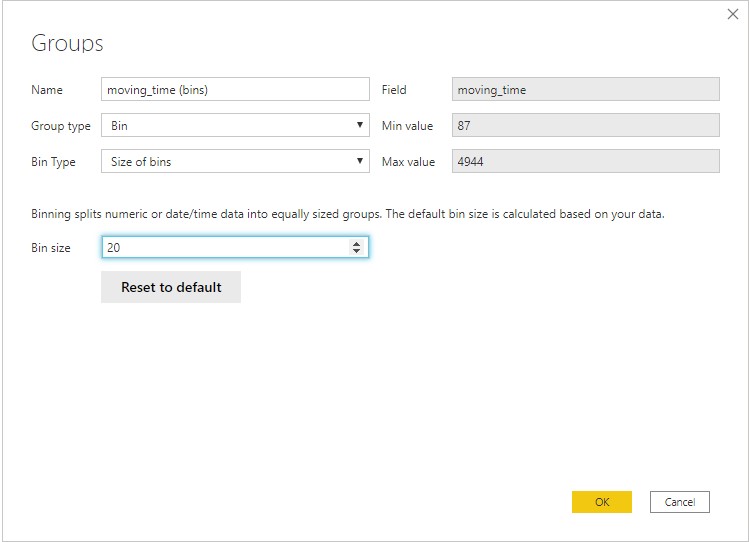
Setting up clusters in Power Bi using a new group / bin
Once you have your groups set up, you need to create a cluster column which can be used as your grouping. For simplicity, this could just be your cluster value we just set up, but for more advanced solutions you need to account for all possibilities. So I used the following formula to set up my clusters.
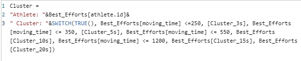
Jitter cluster formula
I have included the athlete id here so these clusters only apply to a given athlete. This isn’t a neccessity but was a simple way for me to visualise how this was going to work. I also included a switch formula to change the size of the cluster depending on the time of the effort. This was important for the different effort distances. If you these were too big, or small, the jitter would look like straigh diagonal lines rather than grouped data.
Now to Calculate the Jitter
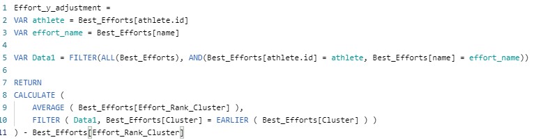
To calculate the jitter for each data point, we need to use three calculated columns. This will allow you to rank the value within the cluster, create an adjustment and the calculate the new value for the y axis.
Cluster Ranking
Next, we need to rank each effort time within it’s cluster so that we can apply an adjustment value to it.
Jitter cluster ranking formula
For this column formula, I have used different “VAR” to help filter the data to the values of the row. This is important to make sure the effort rank applies only to the selected athlete in my dataset.
Calculate the Adjustment
Now we can calculate the value we apply to adjust the y axis value.
Jitter Y-Axis adjustment
The adjustment is calculated as an average of the values within the cluster, minus the rank of the value within the cluster.
Apply the Y-Value Adjustment
The last step is to apply the adjustment to the Y-Value. For this chart, I used a simple value of one.

Jitter Y-Axis Adjustment Calculation
I used the multiplied by 3.5 value to help spread my points a little better, you can play around with this value until your dots are spread nicely.
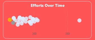
The End Result
The final result is a jitter chart that looks like this.
Jitter Chart in Power Bi
This chart also has my top three effort times in Gold, Silver and Bronze. But the chart itself is nicely spread without straight lines.
Hopefully this step by step tutorial will help you create a nice jitter chart in your next Power Bi report. If you have any problems, or even a better way of doing this I would greatly appreciate the feedback.
Thanks to Strava for the API access and Power Bi for the awesome Bi tools!
Stay safe!