For this tutorial I am going to show you how to plot all the passes from a match on a pitch. We are going to go through this in a few steps and add some detail as we go. To start, the packages I am using in this tutorial are as follows:
library(tidyverse)
library(ggplot2)
library(ggsoccer)
I always use the entire tidyverse, some of you might like to only use particular packages, but for me this is what I prefer to do. I use ggplot2 for my graphs and ggsoccer is used to annotate the pitch. I have already imported my data using read_csv and I have also used mutate to identify passes that are successful and unsuccessful.
As a first step, we will create the pitch we are going to annotate over using ggsoccer:
pitchplot <- data %>%
  ggplot(aes(x=x, y=y)) +
  annotate_pitch(dimensions = pitch_statsbomb, colour = "white", fill   = "chartreuse4") +
  theme_pitch() +
  theme(plot.background = element_rect(fill = "chartreuse4"),
        title = element_text(colour = "white"))

pitchplot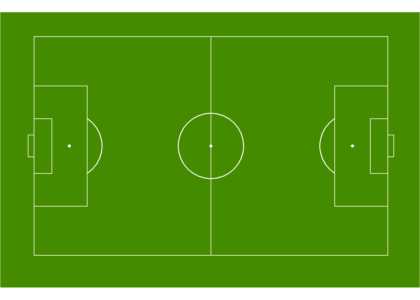
In the code above, we use annotate_pitch to create the pitch, specifying the dimensions and colours to be StatsBomb size and a nice green colour. Theme_pitch removes all axes from the pitch, whilst theme colours the background around the pitch. Removing the final statement would leave a plain white background around the pitch, which also doesn’t look too bad to be honest.
Now we have our pitch, let’s plot the passes from one team on the pitch:
pitchpassplot <- data %>%
  filter(Team == "Arsenal WFC") %>%
  ggplot(aes(x=x, y=y)) +
  annotate_pitch(dimensions = pitch_statsbomb, colour = "white", fill   = "chartreuse4") +
  geom_point() +
  theme_pitch() +
  theme(plot.background = element_rect(fill = "chartreuse4"),
        title = element_text(colour = "white"))

pitchpassplot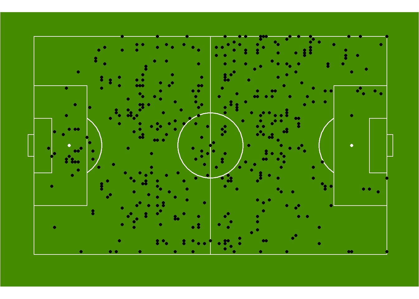
By adding geom_point we can now visualise all of our passes across the pitch for Arsenal during a single match. But this isn’t that helpful so let’s add a little detail by colouring the the dots by if the pass was successful or not.
passplot <- data %>%
  filter(Team == "Arsenal WFC") %>%
  mutate(Successful = as.factor(Successful)) %>%
  ggplot(aes(x=x, y=y)) +
  annotate_pitch(dimensions = pitch_statsbomb, colour = "white", fill   = "chartreuse4") +
  geom_point(aes(colour = Successful)) +
  theme_pitch() +
  theme(plot.background = element_rect(fill = "chartreuse4"),
        title = element_text(colour = "white"),
        legend.position = "none")

passplot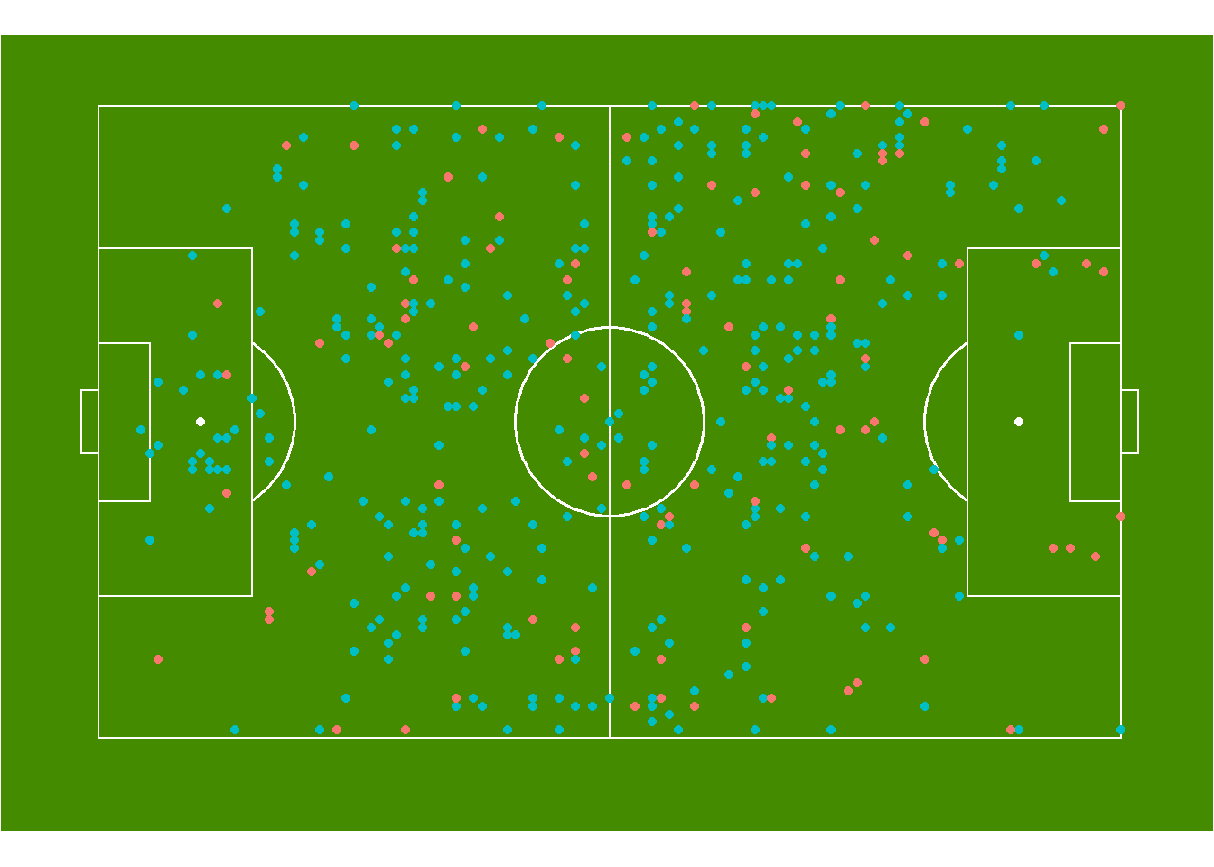
By just adding a colour statement to the aesthetics of geom_point, we can now see that all the red passes were unsuccesful, whilst the blue passes were successful. Now we can start to get a better idea of how well a team performed in terms of passes during a match. We can add even further detail to this by plotting the end location of each pass as well, using geom_segment. So let’s try this now:
passdirectionplot <- data %>%
  filter(Team == "Arsenal WFC") %>%
  mutate(Successful = as.factor(Successful)) %>%
  ggplot(aes(x=x, y=y)) +
  annotate_pitch(dimensions = pitch_statsbomb, colour = "white", fill   = "chartreuse4") +
  geom_point(aes(colour = Successful)) +
  geom_segment(aes(x=x, y=y, xend=pass.end.x, yend=pass.end.y, colour=Successful), alpha = 0.4) +
  theme_pitch() +
  theme(plot.background = element_rect(fill = "chartreuse4"),
        title = element_text(colour = "white"),
        legend.position = "none") +
  facet_wrap(~Successful)

passdirectionplot
This plot now shows us all the passes, with their end locations and if they were successful or not. I used facet_wrap to make it a little easier to view the passes, but it is still quite condensed in an image this small. But we can see how this type of information might be helpful for a coach to identify team trends but we can also be narrow down to one particular player, so let’s do that now and see what we find.
passplayerplot <- data %>%
  filter(Team == "Arsenal WFC" & player.name == "Danielle van de Donk") %>%
  mutate(Successful = as.factor(Successful)) %>%
  ggplot(aes(x=x, y=y)) +
  annotate_pitch(dimensions = pitch_statsbomb, colour = "white", fill   = "chartreuse4") +
  geom_point(aes(colour = Successful), size = 2) +
  geom_segment(aes(x=x, y=y, xend=pass.end.x, yend=pass.end.y, colour=Successful), alpha = 0.4, size = 1) +
  theme_pitch() +
  theme(plot.background = element_rect(fill = "chartreuse4"),
        title = element_text(colour = "white"),
        legend.position = "none")

passplayerplot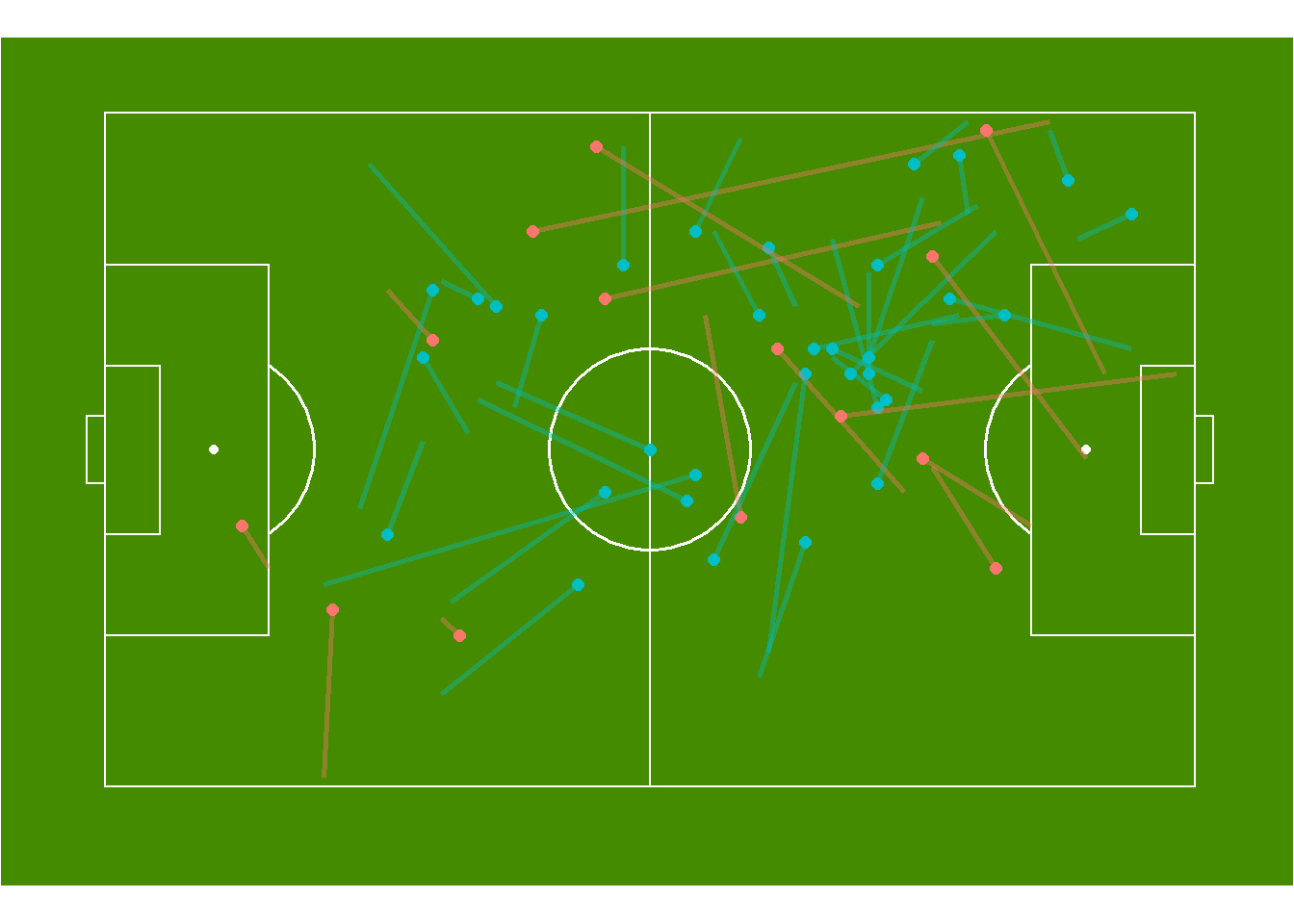
The above graph plots the passes of Arsenal midfielder, Danielle van de Donk. What we can see from this is she appears to play a variety of passes in terms of length and direction, as any good midfielder does. We could do this for any player on the field and attempt to find where their strengths and weaknesses might be, or we can use it as a visual representation of a teams passing abilities.
As you can see, plotting passes on a pitch can start conversations with coaches around, but more information is required to understand this data fully. Event data such as that from StatsBomb provides part of the picture, but to fully appreciate it, optical tracking or video will provide the extra information required to examine performance of a team.
Thanks again to StatsBomb for the data.
Would appreciate any feedback and if anyone has any questions please don’t hesitate to reach out!