Hi all,
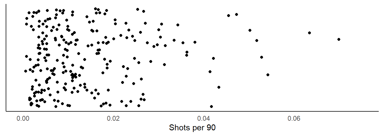
In this post I am going to show you one method of comparing groups of players. You will often find in football analytics the use of per90 metrics. Not every player will play the same number of minutes in a match and so this is one way of normalising player output for comparisons. For example, here is plot showing shots per 90 in the FA WSL.

With this image we can see the spread of players in the FA WSL and their shot per 90 value on the x-axis. This is a simple way of showcasing these values, but there are some important things to take note of and think about when trying to rank player performance on metrics like this.
For example: * The minutes a player plays may affect this value massively. + Such as having played a low number of minutes but having a higher number of shots. * The success of the players team in a given season.
When looking at per 90 values, always try to take these in to account as a player with a lower value may actually be over performing in relation to the team they are on or the number of minutes they play.
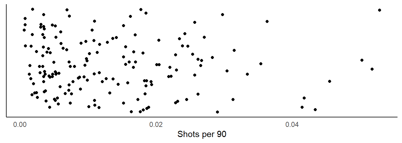
As an example, let’s now change our graph to filter players who have played more than 1000 minutes and see how the image changes.

The main difference between our two images is clearly the number of dots, but also the spread of our data. Our filter has removed some players that have a high number of shots compared to minutes played. But again, this can also lead to some errors in interpretation, such as:
- Are the best players all playing the most minutes?
- Unfortunately, probably not and this could be down to any number of factors such as injury.
- A younger player may play less but their numbers may be accurate based on the player they are.
- Such as low minutes and high shots might show the potential of a player.
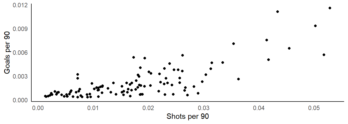
Finally, looking at a metric in isolation might not provide all the information you need to make a decision. One example, albeit maybe not the best, is to compare shots and goals per 90.

In this example, being higher on the y-axis and lower in x-axis might highlight a player converting more of their shots in to goals. Where as a player that is lower on the y-axis and higher on the x-axis is taking a lot of shots but not converting them. This is a simple way of comparing players across the entire league, or more so we could group them by position.
To summarise, using per 90 metrics is a great way of normalising player performances over time. Taking in to account minutes played allows us to more easily see which players might be performing better than others for a given metric. However, we must remember that their are a number of factors that could influence player values. These factors might result in a player with potential hiding within the pack but actually excelling in their performances.
These are just a few things to keep in mind.
I hope you enjoyed this post and if so feel free to comment below.